


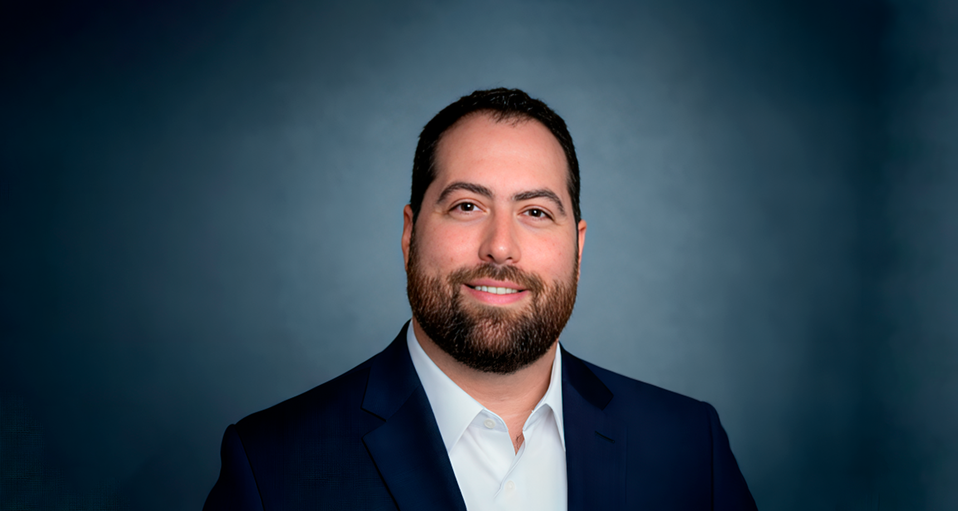
The average healthcare executive dashboard is an exercise in reassurance. Millions of events processed. Thousands of threats blocked. Uptime at 99.9 percent. Every tile is green, and none of it answers the question a board needs answered: is this organization carrying more risk than it agreed to carry? Nick F. Hernandez, who leads technology at ZyDoc, argues that most of these screens fail not because the data is wrong but because the data was never chosen to support a decision. In an environment regulated by the Health Insurance Portability and Accountability Act (HIPAA), where an outage, a breach, and a failed recovery all end in the same place, that failure has a cost measured in patient care rather than quarterly variance.
The Five Layers That Belong On An Executive Screen
Hernandez structures the executive view around five layers; each tied to a question leadership already asks. Service health comes first, but expressed in terms of clinical and commercial impact rather than infrastructure. “Don’t show CPU on cluster B,” he says. “Show whether the systems our clients depend on are up and fast enough.” That means availability and latency measured against service level agreements for the services touching patient care or revenue. Security posture follows: open critical vulnerabilities and their age, multifactor authentication (MFA) and privileged-access coverage, endpoint gaps, live incidents, and their status. Then protected health information (PHI) exposure and access, which Hernandez frames bluntly as a board-level concern. “Who touched PHI, and should they have?” is not a question a chief information security officer fields alone in a regulated setting.
The fourth and fifth layers are where most dashboards quietly go missing. Resilience means the last tested restore, whether recovery-time and recovery-point targets were genuinely met in that test, and whether backups are immutable and verified. Hernandez is sharp on the distinction: “A backup nobody has tested only tells you a job ran. It doesn’t tell you that you can recover.” Compliance drift covers controls that have fallen out of their required state since the last audit, plus vendor risk. Underneath all five sits a single design rule that would strip half the tiles off most existing dashboards. Every tile needs an owner, a threshold, and a defined action. A number that does not trigger a decision does not belong.
Reporting Risk, Not Activity
The dividing line between what executives see and what engineering keeps is not seniority. It is the type of decision the number drives. Hernandez applies a single test: does this metric change a business decision, or does it change a technical action? Executives decide on risk acceptance, investment, staffing, and whether to notify customers or regulators. Engineers decide what to fix next. A metric that only helps someone choose which server to patch stays downstairs. Engineering tracks all common vulnerabilities and exposures (CVEs); leadership sees the percentage of critical vulnerabilities fixed inside the policy window and the 90-day trend. Both views draw from the same source, and an executive can drill through to the raw telemetry. That linkage is not a nicety. “When those two sets of numbers don’t agree,” Hernandez says, “people stop trusting either one.”
The deeper error is building a dashboard that reports activity instead of risk. Volume metrics look reassuring and tell the board nothing about whether the organization is safer than it was last quarter. Worse, a wall of green manufactures false confidence while the risks that matter most stay invisible: untested backups, stale privileged accounts, and a vendor holding PHI access with no current assessment. Hernandez counters this in three ways:
- Frame every metric against a risk appetite leadership agreed to in advance, so red means the organization has exceeded what it accepted.
- Include leading indicators such as patch aging, control drift, and restore testing, not just incidents that already happened.
- And put the blind spots on the screen deliberately. Every metric shows its coverage, so leadership sees “zero critical vulnerabilities across 82 percent of our environment” rather than a clean zero.
His team reconciles asset inventories against each other to find unwatched systems, flags telemetry sources that have gone silent, and surfaces unsanctioned software as a service (SaaS) and AI tools. “A green tile with 60 percent coverage is a very different story from a green tile with 99 percent,” he says, “and executives deserve to know which one they’re looking at.” Counterintuitively, that honesty is usually the part of the dashboard that gets funded.
Governing AI Before It Reaches The Dashboard
AI risk cannot be monitored when AI use is scattered across personal accounts and browser tabs, which is why Hernandez started upstream of the dashboard entirely. ZyDoc built a central AI portal: one place where employees reach every approved model, governed by design. Only vetted models are available, and any vendor that could see PHI is covered by a signed business associate agreement (BAA) with appropriate data-retention terms. Employees sign in with corporate credentials, with model and data access matched to role. Prompts are screened before leaving the environment, with sensitive data redacted or blocked by policy. Every interaction is logged, producing both an audit trail and real usage data.
The insight that made it work has nothing to do with enforcement. “Policy alone doesn’t stop shadow AI. Convenience does,” Hernandez says. The portal had to be faster, more capable, and better connected to existing tools than the alternatives. When the sanctioned path is the easy path, people take it. Because everything flows through one place, the executive view can show AI risk live: portal adoption trending up against unsanctioned AI traffic trending down, which Hernandez calls the single best measure of whether governance is working. Blocked or redacted PHI events, and where they originated, point to where training or workflow needs to change. Every approved model carries a named owner, a documented use, and a last review date, with overdue reviews flagged red. For models supporting documentation work, the team tracks accuracy, drift, and human override rates. A rising override rate functions as an early warning. Vendors whose BAAs or assessments have lapsed surface immediately. Models, prompts, and vendors change far faster than an annual audit cycle, which makes continuous monitoring the only honest way to govern AI.
Follow Nick F. Hernandez on LinkedIn for more insights on infrastructure monitoring, healthcare IT risk governance, and AI compliance.